BRAND IDENTITY | PACKAGING DESIGN
BRAND IDENTITY | PACKAGING DESIGN
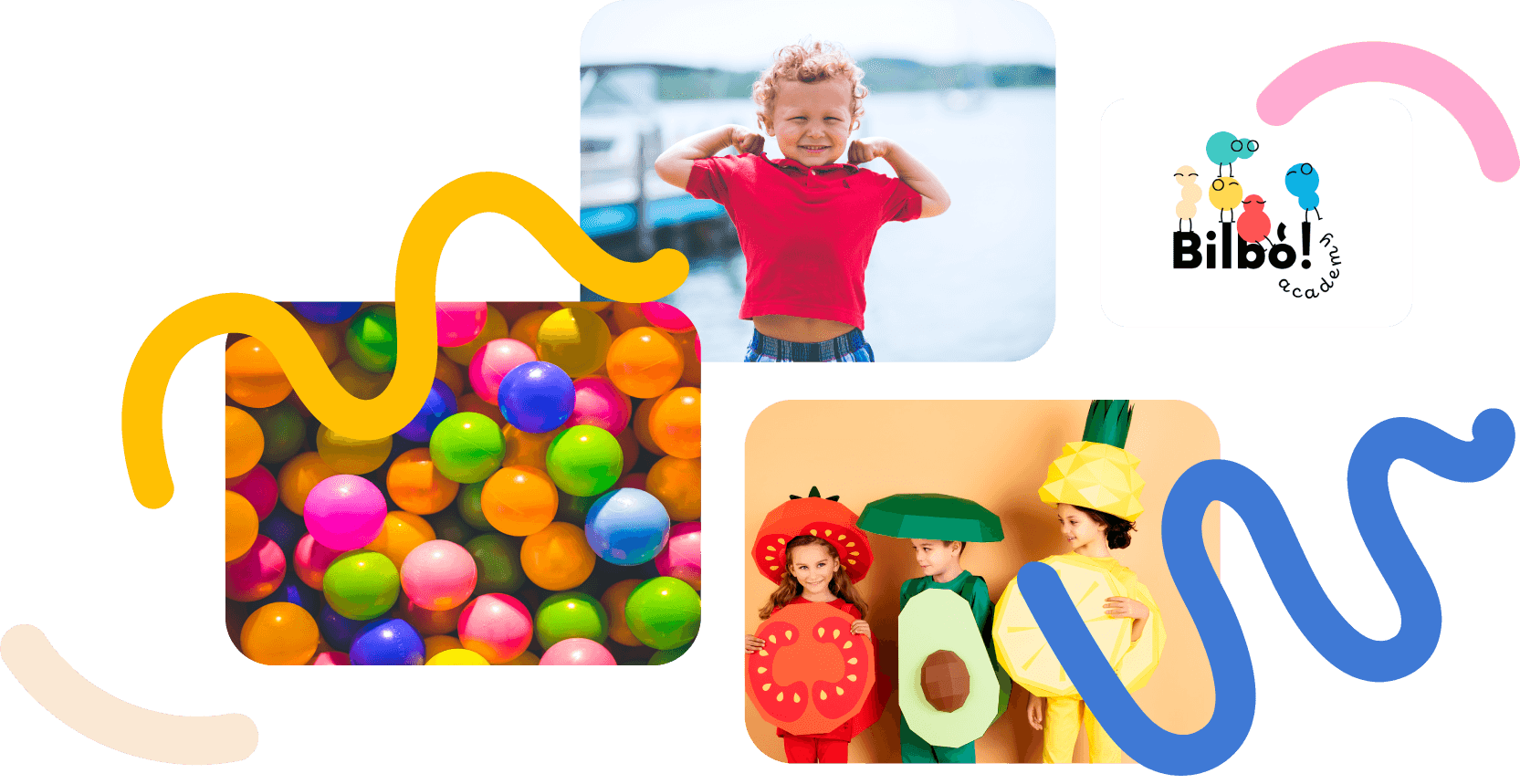
RORY (bg Popu)
RORY (bg Popu)
RORY (bg Popu)
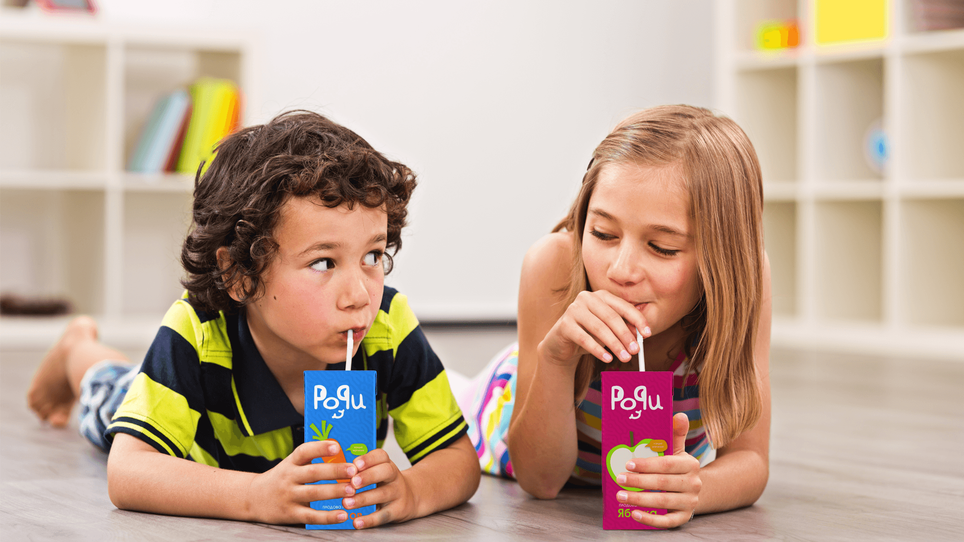
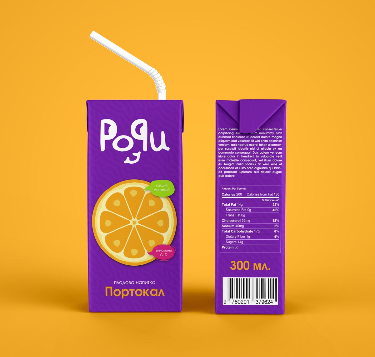
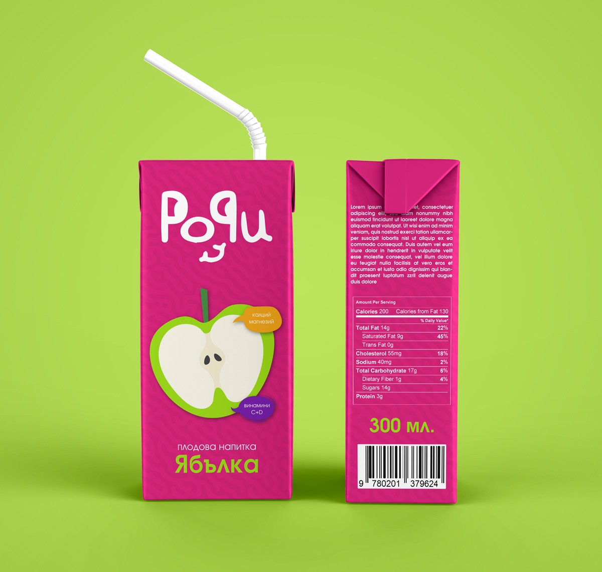
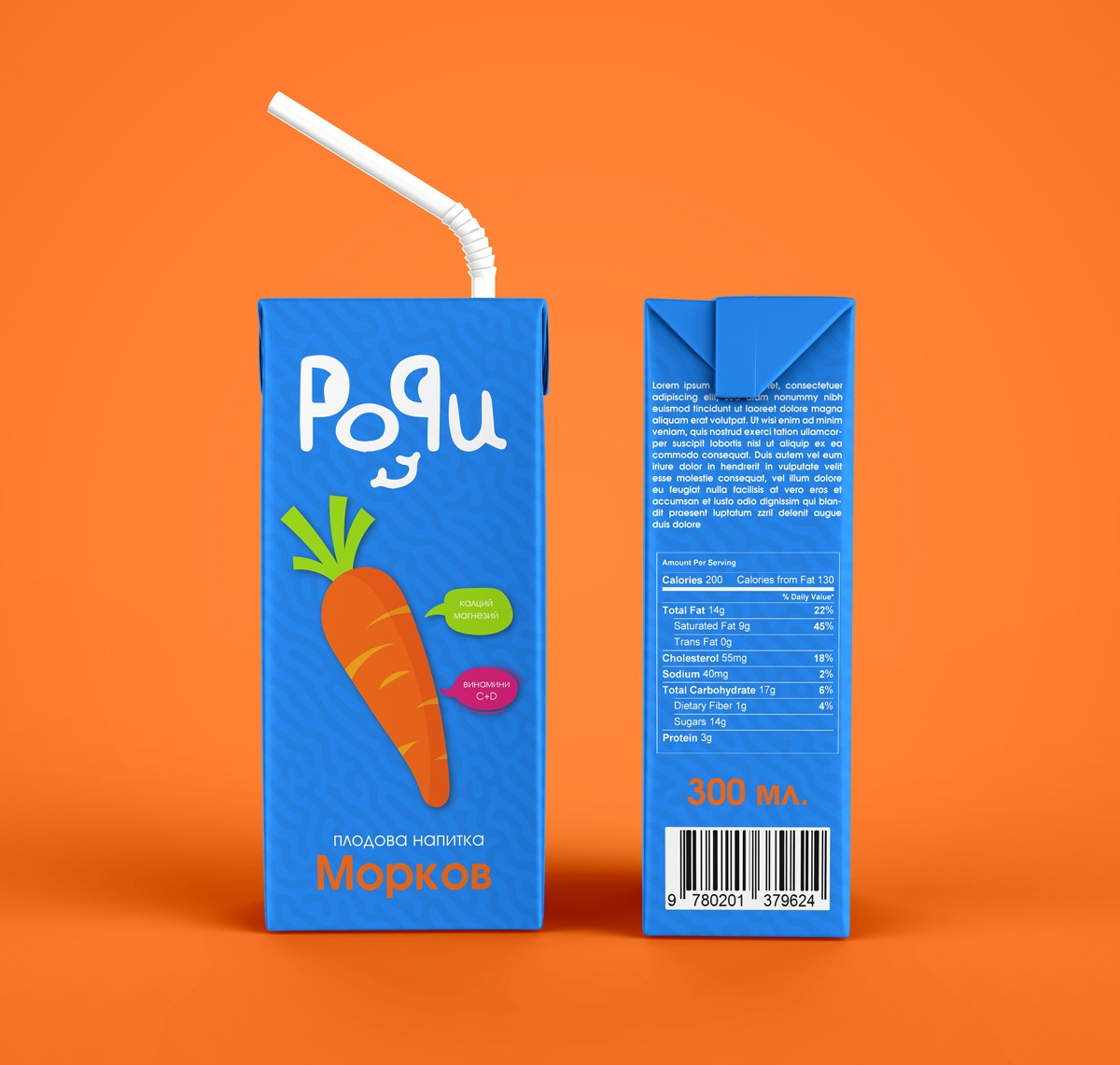
Rory (”Popu” in bulgarian) is a range of fruit drinks (water + juice) for children with added vitamins and minerals. The range consists of 3 pleasant and natural flavors (2 fruit - apple and orange and 1 vegetable - carrot), with added calcium and magnesium, as well as vitamins C and D. The products are unique because of the combination of flavors and added benefits, specially developed for children.
Rory (”Popu” in bulgarian) is a range of fruit drinks (water + juice) for children with added vitamins and minerals. The range consists of 3 pleasant and natural flavors (2 fruit - apple and orange and 1 vegetable - carrot), with added calcium and magnesium, as well as vitamins C and D. The products are unique because of the combination of flavors and added benefits, specially developed for children.
Rory (”Popu” in bulgarian) is a range of fruit drinks (water + juice) for children with added vitamins and minerals. The range consists of 3 pleasant and natural flavors (2 fruit - apple and orange and 1 vegetable - carrot), with added calcium and magnesium, as well as vitamins C and D. The products are unique because of the combination of flavors and added benefits, specially developed for children.
The challenge
The challenge
The challenge
To make the fruits and vegetables in the beverage an enjoyable experience for children and to ensure the parents of the quality of the product.
To make the fruits and vegetables in the beverage an enjoyable experience for children and to ensure the parents of the quality of the product.
The solution
The solution
The solution
Children are usually attracted to bright colors and fun illustrations. Therefore the main colors used are bright and catchy. To ensure parents of the quality of the product the main information is on the front and easy to read. So when the kid wants the juice the parent grabs it quickly without hesitation.
Children are usually attracted to bright colors and fun illustrations. Therefore the main colors used are bright and catchy. To ensure parents of the quality of the product the main information is on the front and easy to read. So when the kid wants the juice the parent grabs it quickly without hesitation.
The logo
The logo
The logo
The essence of the logo design revolves around infusing personality into the typography. Employing a whimsical and playful approach, each letter is meticulously hand-drawn to captivate a youthful audience. The fusion of both "P" letters creates a friendly face, completed with a warm smile, instilling the brand with a sense of approachability and charm.
The essence of the logo design revolves around infusing personality into the typography. Employing a whimsical and playful approach, each letter is meticulously hand-drawn to captivate a youthful audience. The fusion of both "P" letters creates a friendly face, completed with a warm smile, instilling the brand with a sense of approachability and charm.
The packaging
The packaging
The vibrant colors adorning the juice packaging are strategically chosen to captivate the attention of children. Coupled with whimsical illustrations, the packaging promises to delight young audiences, ensuring an engaging and memorable experience. Meanwhile the packaging is conveying a sense of quality and reassurance to parents.
The vibrant colors adorning the juice packaging are strategically chosen to captivate the attention of children. Coupled with whimsical illustrations, the packaging promises to delight young audiences, ensuring an engaging and memorable experience. Meanwhile the packaging is conveying a sense of quality and reassurance to parents.
© 2025 Michaela Krasteva. All right reserved.
© 2025 Michaela Krasteva. All right reserved.
© 2025 Michaela Krasteva. All right reserved.