BRAND DESIGN | PACKAGING DESIGN
PRIMA FORTIS
PRIMA FORTIS
PRIMA FORTIS
Prima Fortis is a small family-owned business based in Bulgaria. They specialize in premium B2B solutions tailored for spa salons. Their core product line consists of massage oils infused with ingredients proven beneficial to the body and mind. Also they offer small range of body and skin care products to direct customers. The owners personally selected each ingredient used in their products.
Prima Fortis embodies the harmonious fusion of chemistry and natural ingredients. The brand is dedicated to providing meticulously crafted products that adhere to the principles of cleanliness and purity, while remaining firmly grounded in the laws of chemistry.
The challenge
The challenge
The challenge
The project involved rebranding an existing identity to create a fresh and appealing look that shifted client perceptions to associate the brand with relaxation and high quality. The objective was to develop a distinctive identity that stood out from competitors while adhering to the client’s preference for a clean and polished aesthetic.
The project involved rebranding an existing identity to create a fresh and appealing look that shifted client perceptions to associate the brand with relaxation and high quality. The objective was to develop a distinctive identity that stood out from competitors while adhering to the client’s preference for a clean and polished aesthetic.
The rebrand
The rebrand
The rebrand
The rebrand did not require keeping any of the previous brand elements. Even the name was changed with something much more meaningful to the owners. The only thing left from before the rebrand are the formulas and ingredients.
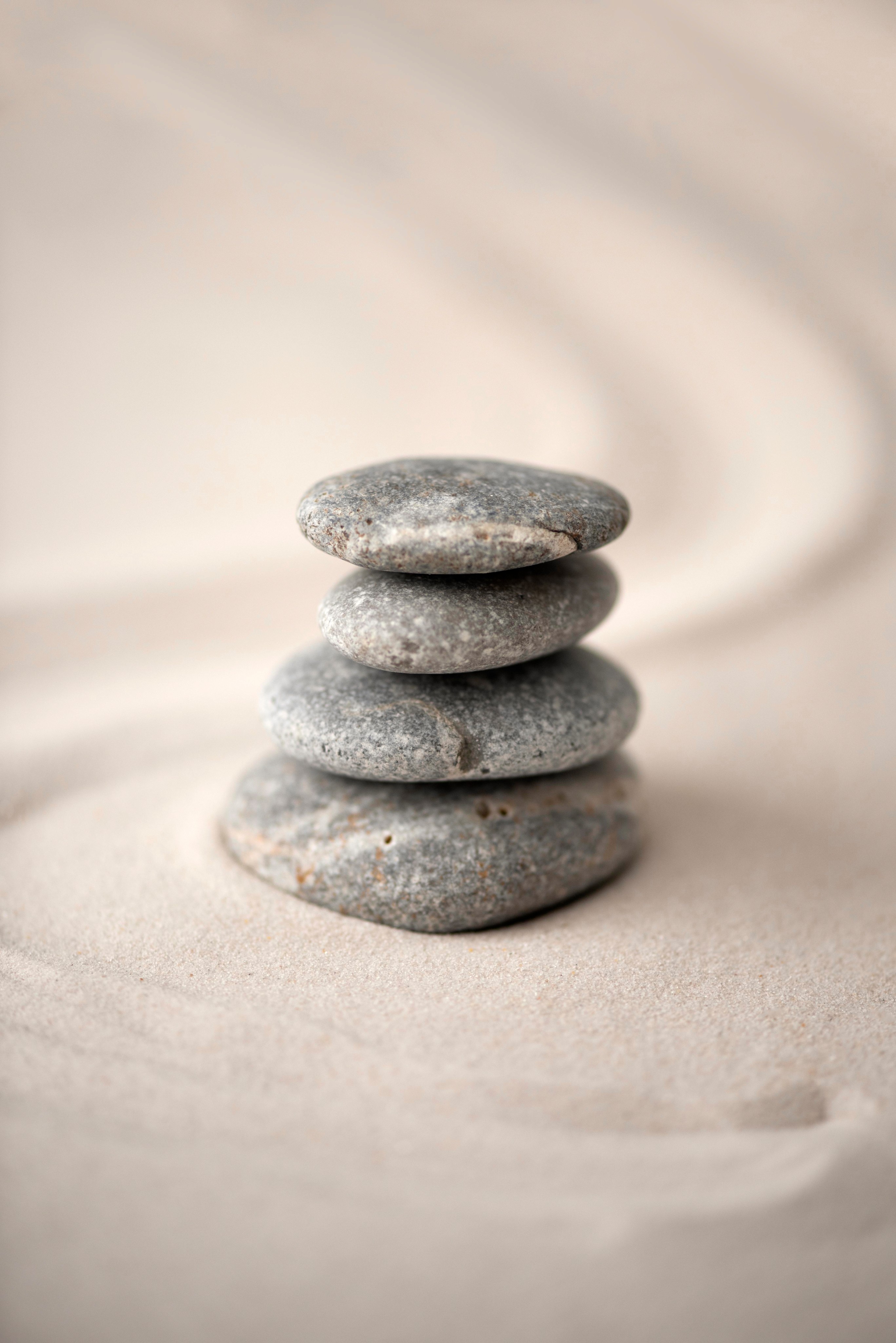
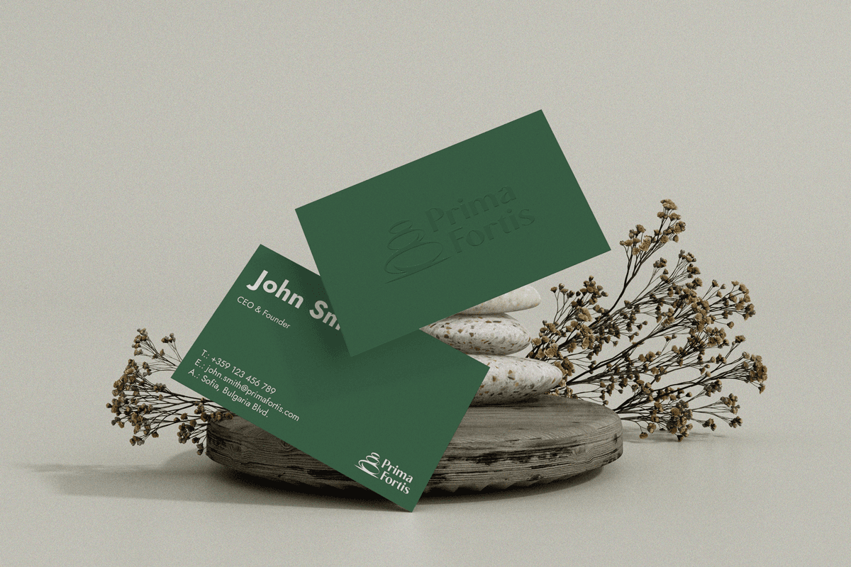
The final logo is highly inspired by the Japanese Zen gardens. Their minimalist landscapes filled with neutral elements are very much like the products of Prima Fortis. The logomark is stylized zen stones that represent the strength and power that the brand wants to give to their clients.
The rebrand did not require keeping any of the previous brand elements. Even the name was changed with something much more meaningful to the owners. The only thing left from before the rebrand are the formulas and ingredients.
The final logo is highly inspired by the Japanese Zen gardens. Their minimalist landscapes filled with neutral elements are very much like the products of Prima Fortis. The logomark is stylized zen stones that represent the strength and power that the brand wants to give to their clients.
Achieving perfect balance in the logo, initially I used a serif font due to its thicks and thins. This resembles the inner balance that the product aims to convey while lying down on the massage table. In order to customize the font to the brand, I removed the serifs. This also corresponds to the name of the brand and makes the font “strong”.
Achieving perfect balance in the logo, initially I used a serif font due to its thicks and thins. This resembles the inner balance that the product aims to convey while lying down on the massage table. In order to customize the font to the brand, I removed the serifs. This also corresponds to the name of the brand and makes the font “strong”.
The packaging
The packaging
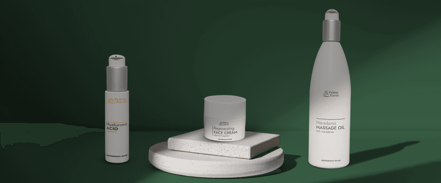
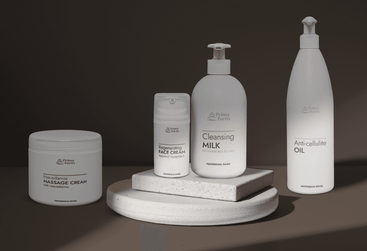
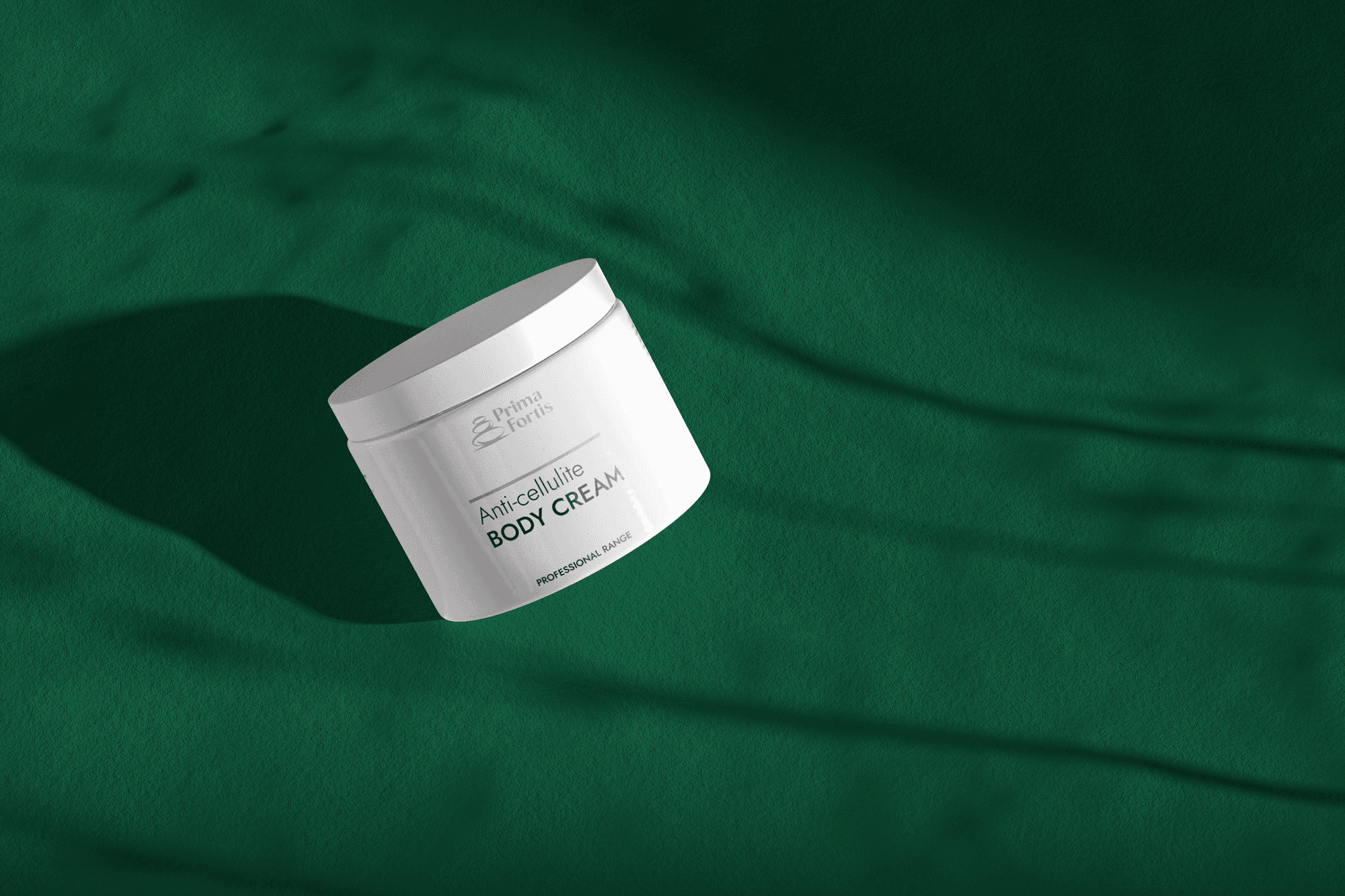
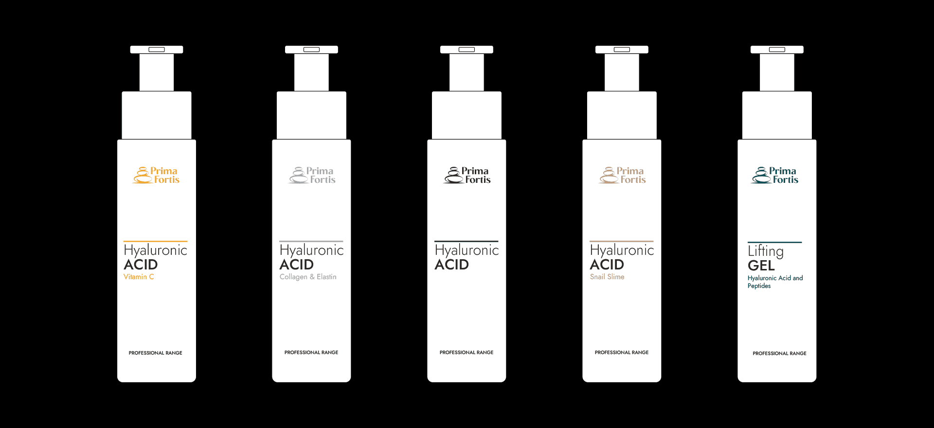
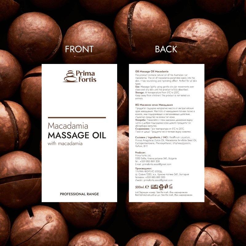
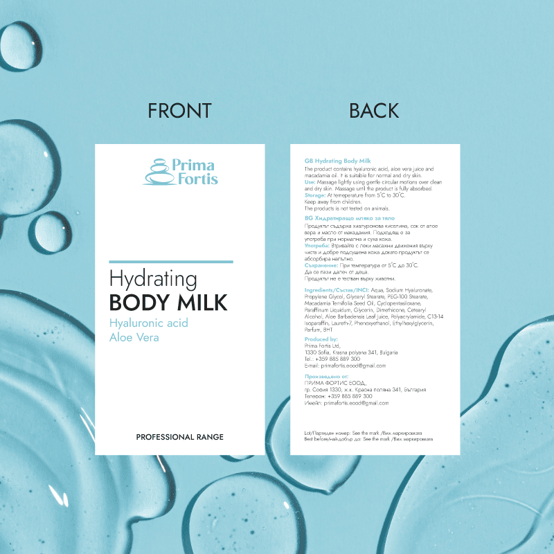
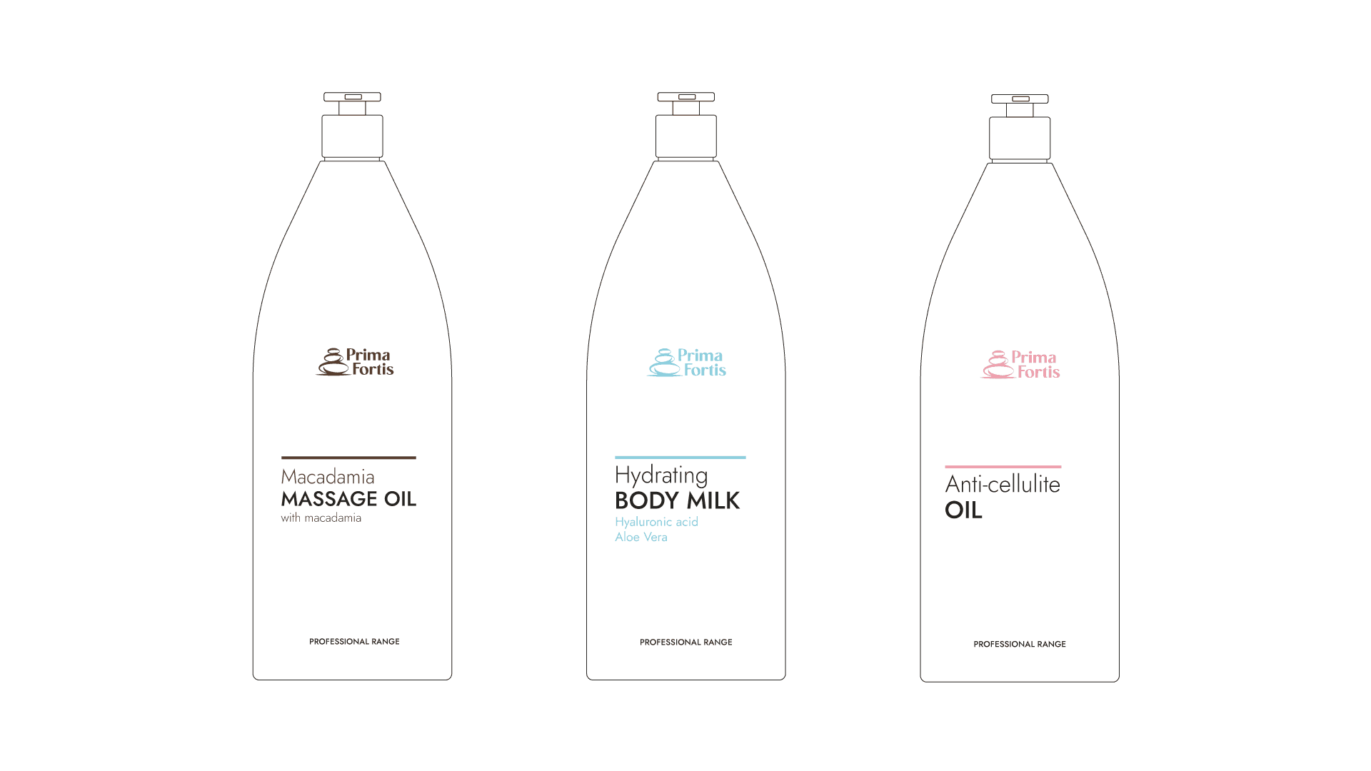
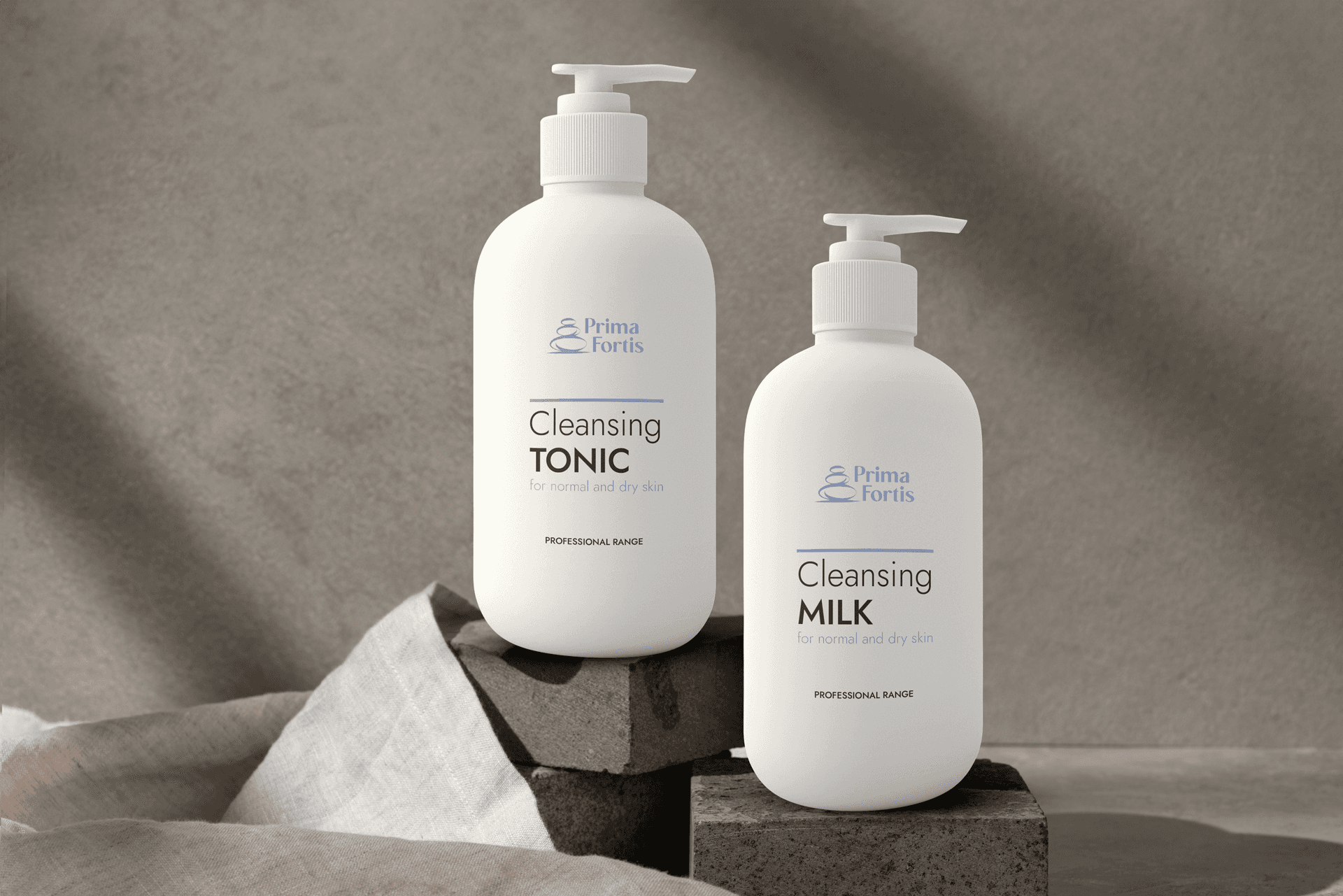
The rebranding of the labels presented a significant challenge, requiring the creation of an entirely new design system. The labels needed to maintain a cohesive design while incorporating subtle distinctions. To achieve a clean and streamlined final product, color was chosen as the distinguishing element. Each product collection was assigned a unique color palette inspired by its ingredients. The placement of design elements on the labels was carefully determined based on the shape and size of each container, ensuring consistency and visual harmony across the entire range.
The rebranding of the labels presented a significant challenge, requiring the creation of an entirely new design system. The labels needed to maintain a cohesive design while incorporating subtle distinctions. To achieve a clean and streamlined final product, color was chosen as the distinguishing element. Each product collection was assigned a unique color palette inspired by its ingredients. The placement of design elements on the labels was carefully determined based on the shape and size of each container, ensuring consistency and visual harmony across the entire range.
© 2025 Michaela Krasteva. All right reserved.
© 2025 Michaela Krasteva. All right reserved.
© 2025 Michaela Krasteva. All right reserved.